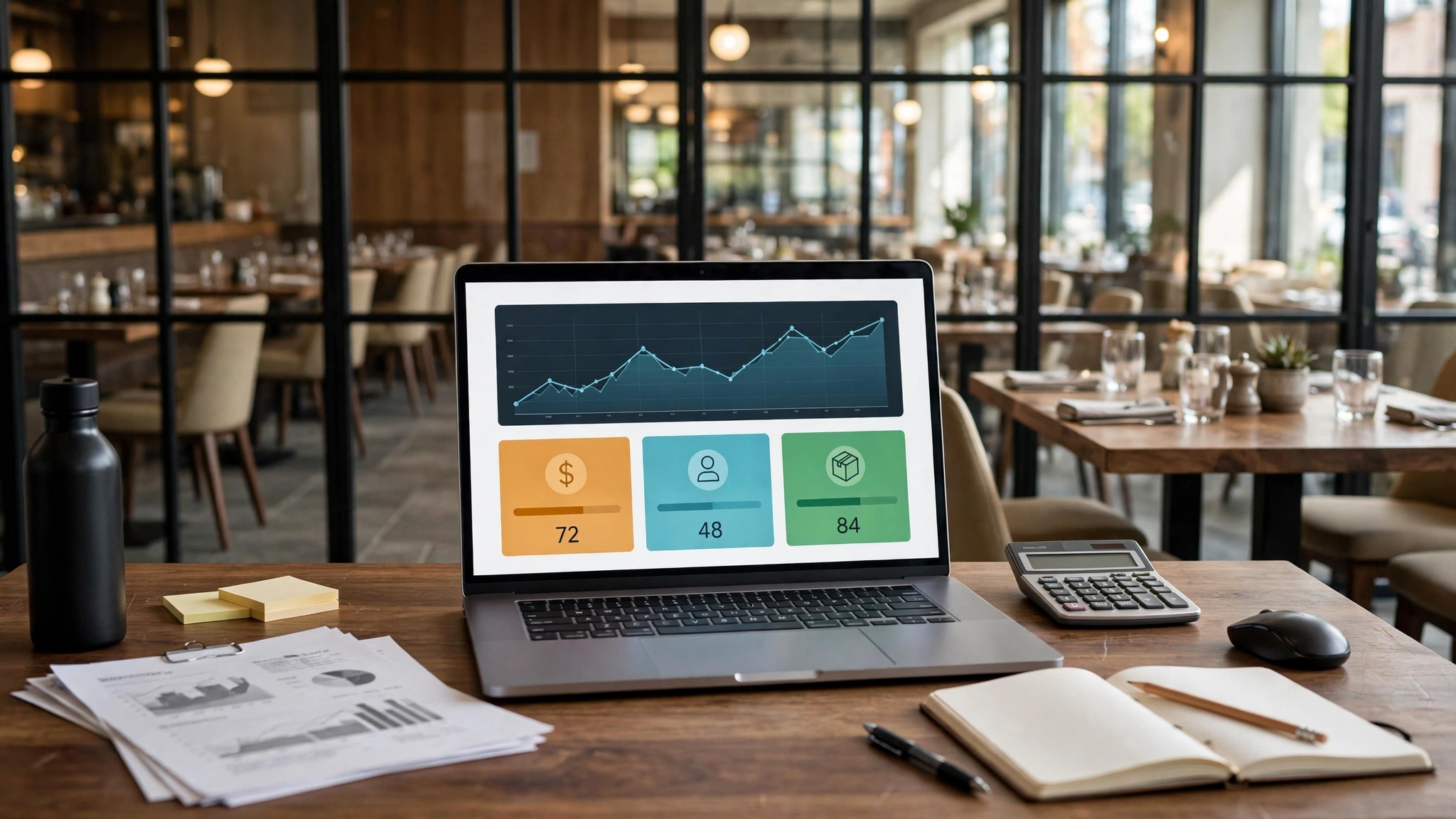
A dashboard should answer decisions, not display everything
Restaurant systems can produce hundreds of metrics. A manager dashboard should show only the small set that changes what the manager does today, this week or this month. The design question is not “What data can we visualize?” but “Which decision becomes faster or better when this number is visible?”
If a KPI has no owner, no threshold and no likely response, it is probably a report metric rather than a dashboard control.
Build three layers: shift, week and month
Shift-level indicators are operational: sales pace, covers/orders, ticket time, voids, labor hours, outages or stockouts. Weekly indicators reveal patterns: food cost, labor productivity, inventory variance, waste, channel mix and repeat service issues. Monthly indicators connect to the P&L: revenue, prime cost, operating margin, cash pressure and structural expenses.
Do not put all three layers on one screen. Managers lose the signal when real-time noise and monthly finance compete for attention.
Choose denominators carefully
A ratio is only as good as its denominator. Labor % uses sales; sales per labor hour uses hours; food cost % may use food sales; ticket time may need order type or daypart segmentation. Define the denominator beside the KPI so different managers do not calculate the same label differently.
When channel mix changes, consider whether dine-in, delivery and catering should be separated. Aggregated metrics can hide a problem in one channel.
Pair lagging results with leading controls
Food cost and profit are lagging outcomes. Waste events, supplier price changes, portion checks and inventory variance can be earlier signals. Labor % is lagging; schedule coverage, forecast error and overtime alerts can be leading controls. A useful dashboard pairs the result with one or two controllable indicators that tell the manager what to investigate next.
This prevents the dashboard from becoming a collection of numbers that describe yesterday without guiding action.
Set thresholds around normal variation
A threshold should reflect the restaurant’s plan, risk and normal volatility. Too tight and managers receive constant false alarms; too loose and the alert arrives after the loss is material. Use historical ranges and business rules to define where an exception deserves attention.
For some controls, absolute thresholds are better than percentages. A $500 unexplained cash variance may matter even if sales are high.
Use exception-first visual design
The dashboard should make exceptions obvious without turning every card red. Show the current value, comparison basis and direction, then provide drill-down only when needed. A manager should be able to answer “What needs attention?” in under a minute.
Avoid decorative charts that require interpretation but produce no action. Simple tables, sparklines and ranked exceptions are often more useful.
Every KPI needs an owner and drill path
For each KPI define: data source, refresh frequency, owner, acceptable range, first drill-down and expected response. If food cost is unfavorable, the drill path might be purchase price → mix → waste → yield → portion. If labor is high, the path might be sales forecast → scheduled hours → actual hours → overtime → productivity.
This transforms a dashboard alert into a repeatable management process.
Example dashboard for an independent restaurant
Today: sales vs forecast, orders/covers, labor hours vs plan, ticket-time exception, out-of-stock items, refunds/voids. Week: food cost, prime cost, sales per labor hour, waste value, inventory variance, channel mix. Month: revenue, operating margin, cash trend and key P&L variances.
The exact KPI set is illustrative. Remove any metric that does not support a decision in your operation.
Dashboard governance checklist
- KPI has a written definition.
- Data source is known.
- Refresh timing matches the decision cadence.
- Owner is named.
- Threshold is intentional.
- Drill-down path exists.
- Action is documented.
- Metric is removed if no one uses it for decisions.
Data-quality warning signs
- Same KPI differs between POS and accounting without reconciliation.
- Managers export spreadsheets and manually overwrite numbers every day.
- Definitions change when performance looks bad.
- A dashboard refreshes faster than the source data can be trusted.
- Missing transactions or late postings create false alerts.
- No one knows who owns a metric after it turns red.
FAQ
Q: How many KPIs should be on the main screen? A: As few as possible while covering the decisions the role owns; often a small set with drill-down is stronger than dozens of tiles.
Q: Should owners and shift managers see the same dashboard? A: Usually no; their decision horizons differ.
Q: Is real-time data always better? A: Only when the data is reliable and the decision needs real-time action.
Q: What should be automated first? A: Repetitive reconciliation and high-value alerts where manual delay causes loss.
Next action
Take the current dashboard or weekly report and mark every metric with one question: “What decision changes because I can see this?” Remove or demote metrics with no answer. For the remaining KPIs, write the first drill-down and owner. That exercise usually improves the dashboard more than adding another data source.
Avoid vanity KPIs
Follower counts, total app downloads or raw order volume may look impressive without improving profit or operations. A KPI earns dashboard space when it changes a decision. If the measure is useful mainly for a quarterly presentation, keep it in a report rather than the manager’s live dashboard.
Review the dashboard quarterly and delete metrics that have not triggered a decision, investigation or learning. Space is a management resource.
Design alerts with escalation tiers
Not every threshold breach should wake the owner. Use tiers: informational, manager attention and critical escalation. A small labor variance may be reviewed at close; a payment-system outage needs immediate response.
Alert fatigue is a design failure. Measure how often alerts fire and how often they lead to action. If most are ignored, change the rule or remove it.
Additional operating detail
A dashboard should preserve context around exceptional days. Promotions, holidays, weather events, closures, equipment failures and large catering orders can make a KPI look abnormal for a legitimate reason. Add short event annotations or compare against genuinely similar periods. Managers should not have to remember every context detail when reviewing a trend weeks later.
Where the stack allows it, separate diagnostic drill-down from the main screen. The manager can click or open a report for item, daypart, employee or channel detail after a KPI flags an exception. This keeps the primary view readable while preserving enough evidence for serious investigation.
Manager implementation notes
Dashboard design should include a data-confidence signal when source quality is imperfect. If inventory has not been counted, label the food-cost estimate as preliminary; if payroll is not closed, do not present labor cost as final. This prevents precise-looking visuals from giving managers false confidence. A simple status such as live, provisional or closed can be more valuable than another chart.
Use the dashboard review to retire work as well as create it. If a KPI remains within range for months because the underlying process is now stable, consider moving it from the front page to a secondary report. The main dashboard should evolve with current risk. Otherwise it becomes a museum of every metric that was once important and managers stop seeing the few exceptions that deserve attention now.
Further operating guidance
A manager dashboard should distinguish controllable performance from descriptive context. Weather, neighborhood events and seasonality may explain demand, but they are not usually actions. Put context beside the KPI without letting it crowd out the controllable levers: staffing, availability, pricing execution, waste, service speed and channel settings. The dashboard should help managers separate “what happened to us” from “what we can change.”
Create a short weekly dashboard review routine: scan exceptions, choose the two or three that deserve drill-down, assign an owner and record the next evidence point. Do not discuss every green metric. This meeting discipline keeps the dashboard tied to action and gives the restaurant a record of which alerts actually produced useful decisions.
Final control note
Include one data-quality review in the monthly management cycle. Check whether delayed imports, changed POS mappings, missing labor feeds or inventory timing altered any KPI definition during the month. When a metric changes because the data pipeline changed, annotate the period instead of letting managers interpret the break as an operating trend. This keeps the dashboard trustworthy as the technology stack evolves.
Give every KPI an owner, action and data status
A dashboard should not display a metric merely because the software can calculate it. For every front-page KPI, define who owns the decision, what action or investigation a meaningful exception can trigger and how fresh the data must be. Daily sales may need same-day visibility, labor can require a close-of-shift or payroll context, while some occupancy or fixed-cost measures are monthly. Matching refresh frequency to decision speed prevents false urgency and keeps the dashboard small enough for managers to use. A red number without a named action path creates anxiety rather than control.
Also show data confidence. If inventory has not been counted, label a food-cost estimate as preliminary; if payroll is not closed, do not present labor cost as final. Use simple statuses such as live, provisional and closed when appropriate. Metric definitions should be documented beside the source: gross versus net sales, labor inclusions, refund treatment and delivery fees. When a definition changes, mark the break in the historical series instead of pretending the trend is continuous. Review the dashboard periodically and retire KPIs that have not led to a decision, investigation or learning; screen space is a management resource.
Build a weekly dashboard review that ends with decisions
The dashboard meeting should be short enough to repeat. Start with exceptions, not every chart. For each meaningful variance, confirm whether the data is complete, identify the most likely operational driver and decide whether the issue needs action, investigation or simple monitoring. Record the owner and the next evidence point beside the metric. If a KPI is green and no decision depends on it, move on. This prevents the meeting from becoming a performance recital. At the next review, begin by closing prior actions before creating new ones. If the metric did not improve, challenge the diagnosis rather than simply extending the same task. A dashboard becomes a management system when it preserves this decision history and makes unresolved exceptions visible; otherwise it is only a visual report.
Keep drill-down detail off the front page
A manager dashboard should show the exception and provide a path to the supporting report, not reproduce every transaction. Keep invoice detail, individual time punches, recipe lines and refund records in their source systems or drill-down views. This preserves a fast decision surface while still making evidence reachable. When managers must scroll through raw detail before noticing the exception, the dashboard has stopped serving its primary purpose.
Additional topic-specific operating notes
- each KPI has a precise definition and data source
- owners know which role acts on each metric
- dashboard data is reconciled periodically to source systems
- Waste, voids, discounts and inventory variance where relevant
- choose the smallest KPI set that supports those decisions
- define source, formula, frequency and owner for every KPI
A dashboard contains 42 charts, yet the manager still asks whether labor is high because sales missed forecast. A better view may need only sales vs forecast, labor hours vs plan, labor %, ticket time and one note on staffing exceptions. More data is not automatically more control.
Useful next resource
Dashboard exception workflow
A useful dashboard should tell a manager what to do when a KPI moves, not merely display the movement. Define the first drill-down and the likely owner for each front-page metric so the review can move from signal to evidence quickly.
| KPI signal | First drill-down | Typical owner | Next evidence |
|---|---|---|---|
| Sales below forecast | Transactions, average check, daypart and channel | General manager / owner | Traffic, conversion or mix explanation |
| Labor above plan | Scheduled vs actual hours, overtime and sales pace | Scheduling manager | Role/daypart variance and cause |
| Food cost worsening | Inventory, purchases, price, mix, waste and yield | Kitchen / purchasing lead | Largest dollar driver |
| Ticket time rising | Station, daypart, item mix and equipment exceptions | Kitchen manager | Bottleneck confirmed by service data |
| Voids/discounts spike | Reason codes, users, shifts and transaction detail | General manager | Operational, training or control cause |
Five rules for a dashboard that managers will actually use
- Keep the front page limited to metrics that can change a decision.
- Label provisional data so managers do not act on incomplete numbers.
- Pair every red metric with a drill-down path rather than a generic warning.
- Begin each review by closing prior actions.
- Retire metrics that repeatedly create discussion but no decision.
The dashboard becomes stronger when the manager can explain not only what changed, but which source report will verify the cause and who owns the next action.
Use the Restaurant Operator Lab tools and related guides only when they directly support the decision described above. Open the free tools library